Whenever I’m working on a collage that’s a work in progress, I like to use glue sticks. And often, when people notice that, they comment that it reminds them of when they made art back in grade school. So, as I continue my Arts & Fails series – where I experiment with different mediums and give myself permission to fail and not necessarily make something completely perfect or polished – I thought, why not experiment with a medium that’s a blast from my past?
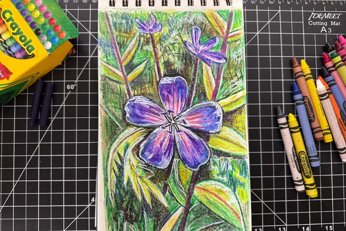
I haven’t worked with crayons since I was probably a kid, and I liked the idea of tackling that medium again to see what happens. I decided to create another composition of a flower inspired by a visit to the New York Botanical Garden. I wasn’t sure what to expect from the process since it’s been a while, but I had a feeling it would be a bit of a struggle.
Here’s the video of the project and process:
Overall, it was definitely a tough medium to work with. But I like a challenge, and I think it would be fun to tackle another composition with crayons in the future. The biggest issue I ran into was that as I added more layers, the surface of the paper became extremely waxy, making it difficult to draw with additional colors. Sometimes I scraped some of the wax off, but overall, it was easy to overwork the surface. I ended up “cheating” a bit by using acrylic paint markers to add some finishing touches.
If you’d like to make your own crayon drawing, here are the supplies I used:
I feel like this series is really helping me get inspired again with art. For so long, I’ve focused on one medium, and although I love making collages, I think it’s important to experiment with others. I’m planning to keep this series going for a while, although I may not post as frequently in the future. Right now, experimenting with different materials has been really important in inspiring my other work.
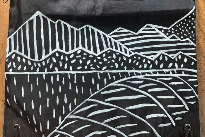
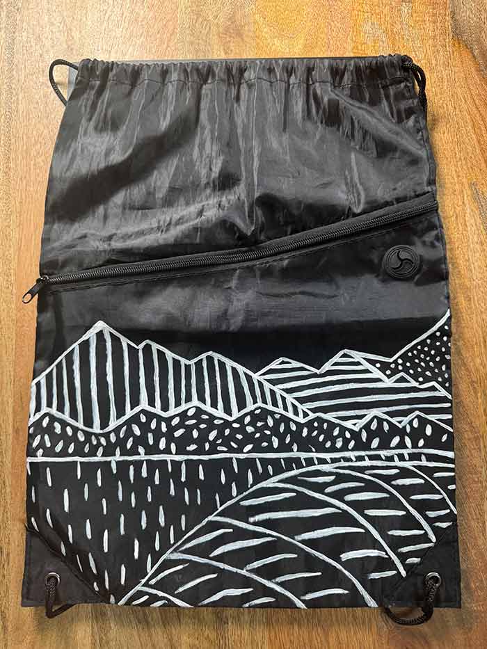
And to continue on with my Arts & Fails series – where I try not to be so precious about the work I make and instead embrace the process of making things – this time I wanted to work with fabric paints. What inspired this particular project, was that I have a few free tote bags, backpacks, and other items with large corporate logos printed on them. I don’t really want to wear things that advertise major companies all of the time, so I figured I’d try to turn one of these items, a drawstring backpack, into wearable art.
Here’s a video of the project and process:
I started off painting over the logo entirely. Then I mapped out the boundaries of the design since the bag is made of a polyester material, and the paint makes it look more matte when it dries. Then I started painting a linear, landscape design. I decided to keep things simple and only use one color, but in the future I really want to work with more of the colors that I now have in my art supplies collection.
If you’d like to make your own fabric painting, here are the paints I used:
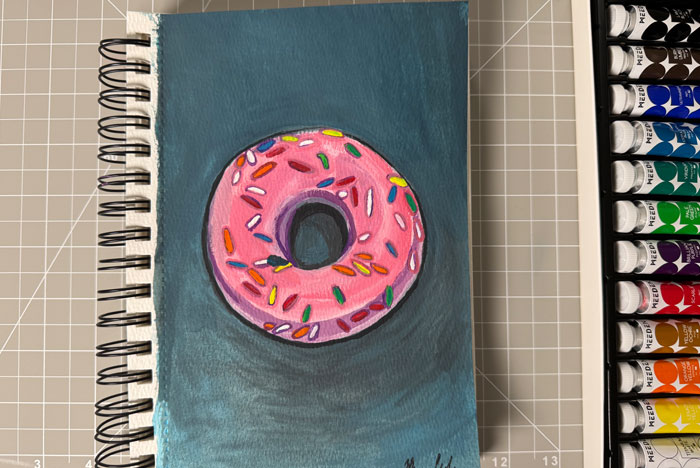
I studied painting back in college, though I only worked with acrylic and oil paints. So I figured, why not try a type of paint I’d never used before? For this piece in my Arts & Fails series – where I experiment with mediums or techniques outside my comfort zone – I decided to try gouache.
I don’t make still life pieces very often, so I also chose a food subject. Previously, I’ve made several donut collages, so this time I went with a gouache donut painting.
Here’s a video of the project:
I began with a sketch, which I then erased to leave faint lines. Next, I blocked in the blue background and pink donut, using plenty of water with the paint. I used detailing brushes to add shadows around and on the donut, as well as highlights. Then I jumped around the piece, adding different colored sprinkles, and finally added shadows to them.
This medium was a bit tricky, and my painting got a little muddied toward the end. I’ve heard gouache can be a difficult medium, and I think the trick is being cautious with how much water you use. I definitely need to experiment with it more – but for a first attempt, I’m glad I gave it a try.
If you’d like to make your own gouache painting, here are the supplies I used:
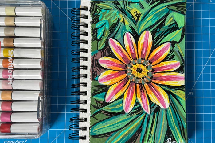
I’m continuing my series where I step outside my comfort zone of making collages and venture into different mediums. This time, I figured I’d try making a drawing with acrylic paint markers, since I’ve been seeing them pop up everywhere online. I wasn’t sure what to expect – when I think of acrylic paint, I usually picture traditional paint that requires mixing colors, rather than layering.
For this piece, I decided to draw a flower inspired by one of my visits to the New York Botanical Garden. I’ve been making quite a few flower-inspired works with other mediums lately, so I figured I’d make one more.
Here’s the video of the project and process:
I started with a sketch and then blocked out the different colors. I bounced around the page, filling in colors here and there to keep a good balance of shadows and highlights. I was pleasantly surprised by how fun this medium was to work with. It was forgiving of mistakes too – once the paint dried, I could easily add another layer.
If you’d like to make your own acrylic marker drawing, here are the supplies I used:
Where’s the fun in doing the same thing over and over again? That’s why I’ve decided to make this Arts & Fails series, where each project involves experimenting with a medium or technique that’s outside of my comfort zone. And who knows, maybe I’ll find a new medium that I’ll like just as much as collage. The goal of this series isn’t to make a perfect, polished, finished work, but to try something new, embrace the mess, and have fun along the way.
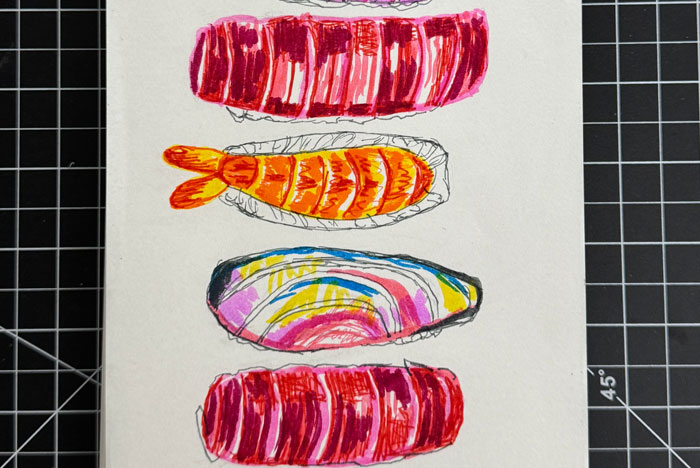
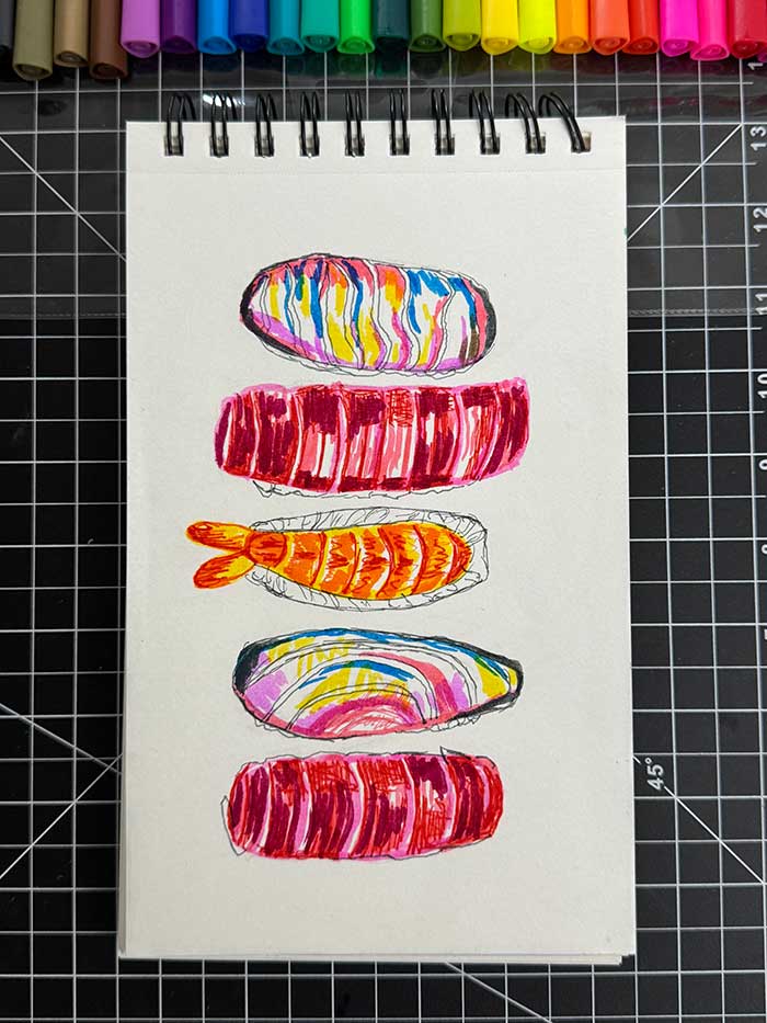
For this project, I decided to get my inspiration from one of my favorite foods, nigiri. Previously, I’ve made a sushi-inspired collage, and at some point I’d like to make a nigiri-inspired collage, but for now, I figured why not make a marker drawing?
Here’s a video of the project:
I began with sketching out the nigiri. Then I worked on layering in lighter colors for the highlights before adding in darker colors on top. The area where I really struggled was drawing the white nigiri – it ended up looking a tad too colorful with too many clashing colors. I think if I were to tackle this composition again, I wouldn’t have used so many bright colors layered for the white pieces. The other ones looked close to what I had in mind, and the colors I selected made it easier to tell what they were supposed to be.
If you’d like to make your own marker drawing, here are the supplies I used:
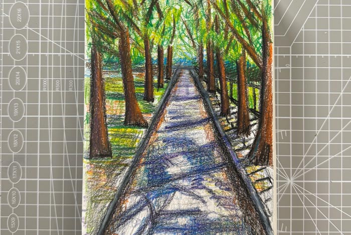
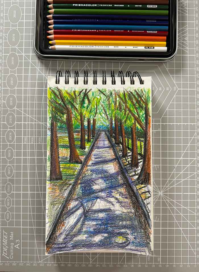
This is the 2nd project I’ve tackled in my Arts & Fails series. Within the past few years, I haven’t done a lot of sketching other than the sketching I do to block out my compositions for my collages. I’d love to delve back into drawing and keep honing other artistic skills. So for this project, I figured why not attempt to make a colored pencil drawing. I’ve never been particularly good at using colored pencils. I’m also not the type of artist who wants to make photorealistic works of art, but I am interested in seeing how I can layer things to make my own representational drawing.
For this piece, I decided to draw inspiration from the Great Saunter, which I participated in earlier this year. If you’re not familiar with the Great Saunter, it’s an event in NYC where participants walk the perimeter of Manhattan, which is about 32 miles. I have never walked that far in a day before, so I wanted to challenge myself. Although I’m glad I did the Great Saunter, I’m not sure if I’ll ever do it again. While walking the perimeter of Manhattan, I took a few photos of the city. And for this piece, I decided to use a few photos of parks and streets as my reference photos.
Here’s a video of the project:
I began the drawing by making a rough sketch of the composition. I bounced around a bit, blocking out colors before layering in yellows and oranges for warm highlights, and blues and purples for the shadows.
Overall, I’d say this was a successful failure. I don’t like how the street is off-centered, and the overall layering is just okay in my eyes. However, I’m proud of myself for working with a medium I rarely use, and I’d definitely like to return to it sometime in the future.
If you’d like to make your own colored pencil drawing, here are the supplies I used:
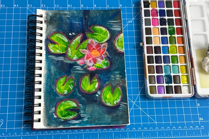
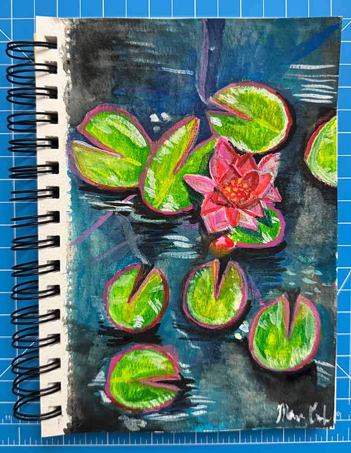
Ever since I was a teenager, I’ve been making collages entirely from magazine cutouts. And ever since I graduated from college with a BA in Art and English, I’ve primarily focused on making my collage art. However, this year, I’ve been feeling a bit restless. I’ve been missing the art experimentation that happens when you take art classes. I miss trying new things, so that I can approach my comfort medium with a fresh perspective. So I’ve decided to start challenging myself with an Arts & Fails series, where I’ll challenge myself with a medium or technique that I’m not familiar with. The goal is to break outside of my comfort zone and try something new. The goal isn’t to create a polished, finished work of art, but to try something new, embrace the mess, and have fun along the way.
The first project I wanted to tackle was watercolor. I had a watercolor set that I ordered a while ago just sitting around, and I really wanted to finally test it out. So for this project, I focused on making a watercolor painting inspired by the Bronx Botanical Garden, from one of my recent visits there. You can check out the video about the process below:
I started the project off by blocking out the different shapes and colors for the watercolor. Then I worked on adding in additional layers, focusing on the highlights first, since those needed to stay light. Then I worked on adding in the shadows and defining the shape of the composition a little better.
As I was working on the painting, I realized I didn’t use nearly enough water. The paint was pretty pigmented. I also ended up using the white a lot to try to undo errors I made with the darker colors. Overall, I thought the final project wasn’t too bad considering I rarely work with watercolors. However, if I were to experiment with this medium again, I would have done the following:
Use more water to create more transparent layers
Sketch out the composition a little better. My initial sketch was very rough and I ended up running into issues where I was trying to reshape the shape of the lilies and flower.
Use less white paint and try to work more with lifting paint up (i.e. adding water to a sponge to remove pigments that way)
If you’re interested in making your own watercolor painting, here are the supplies I used for mine in case you’d like to get the same things:
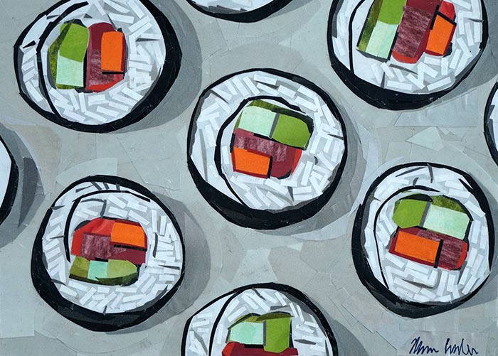
Lately I’ve been trying to explore subjects that I haven’t spent much time on in the past. Generally I avoid still life or landscape compositions, so this year, I’m trying to work on tackling more still life collages. “Sushi Time” is a piece that I completed the other night, inspired by one of my favorite foods. I had a lot of fun working on the detailing of this piece – including cutting out the tiny pieces of paper to mimic the texture of rice in sushi rolls.
There’s something timeless about honoring a beloved pet through art. For years, I’ve been creating custom pet portraits entirely from magazine cutouts – a process I call “painting with paper.” Instead of brushes and paint, I carefully layer bits of printed color and texture to bring animals to life. The result is a vibrant, contemporary work of art that captures your pet’s personality in a way that feels both familiar and unexpected.
A Unique Way to Celebrate Your Pet
A pet portrait is more than just a picture – it’s a lasting keepsake. Each piece is hand-cut and hand-assembled, meaning no two works are ever alike. Whether you’re an art lover who appreciates original work, or you’re looking for a meaningful way to celebrate your pet, a portrait brings warmth and character to any space.
Perfect as Gifts
Custom portraits also make thoughtful gifts for family, friends, or anyone who has a deep bond with their pet. A handmade artwork goes beyond the typical framed photo—it’s a one-of-a-kind keepsake that can be passed down for years to come.
Some of My Favorite Pet Portraits
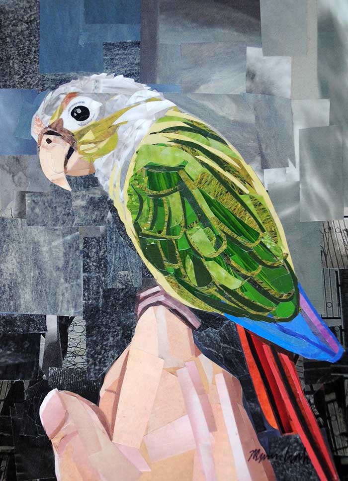
“The Colorful Conure,” Collage on paper, 7″x5″ Order a print
One of my most memorable commissions was a conure portrait created for a client’s daughter who had studied my art in school. It was incredibly meaningful to know that my work had inspired her studies, and being asked to create a portrait of her beloved pet felt like the perfect full-circle moment.
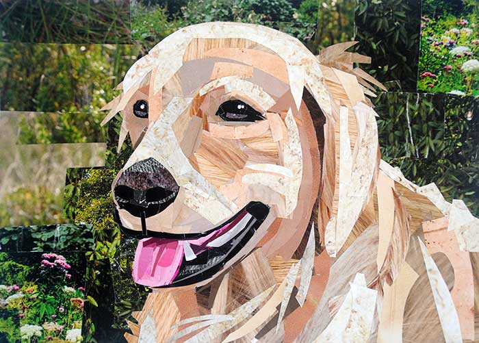
“The Happy Bernedoodle,” Collage on paper, 7″x5″ Order a print
This cheerful Bernedoodle portrait was all about capturing joy. I used layers of textured magazine strips to bring out the fluffy fur and big smile, creating a piece that radiates warmth and playfulness.
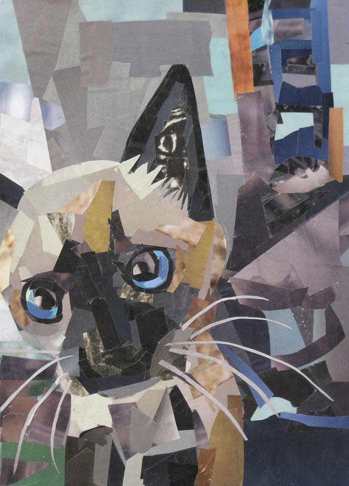
“The Curious Kitten.”Collage on mat board. 7″x5″ Order a print
Sometimes everything just falls into place, and that’s what happened with this cat portrait. Using a soft, neutral palette, the collage came together seamlessly—highlighting the cat’s elegance and quiet personality.
“Fluffy the Chinchilla – Front.”Collage on paper. 7″x5″ Order a print
I don’t often get requests for exotic pets, so I was thrilled to create a collage portrait of a chinchilla. Their soft fur and delicate features made this a fun challenge, and the result is one of my most unique pet portraits to date.
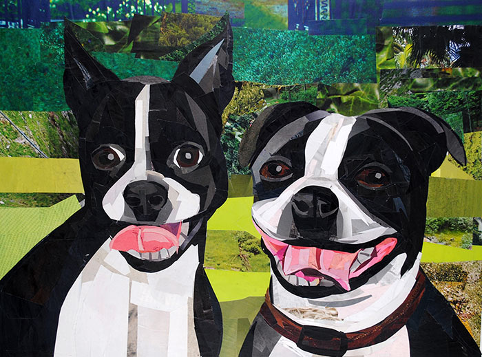
“Meet the Bostons – Ivy and Molly.” Collage on paper. 12″x16″ Order a print
I’ve worked on several Boston Terrier commissions, and each one has reminded me of how expressive and happy this breed can be. Their playful personalities and big smiles make them especially fun to capture with my “painting with paper” technique.
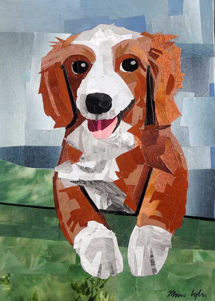
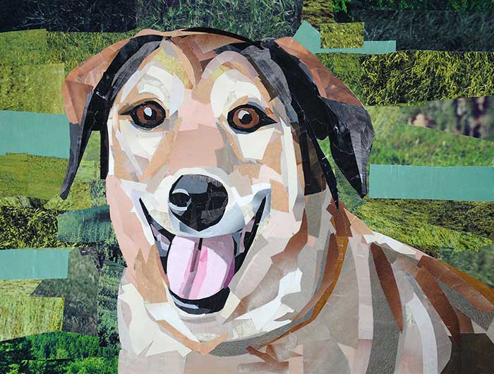
Over the years, one client has returned to me again and again for custom portraits of her dogs. Her most recent commission was of a smiling pup, which was a joy to work on since it continued a larger series of pieces that celebrate the pets who’ve been part of her life.
How to Commission a Pet Portrait
Commissioning a portrait is simple: you provide a few favorite photos, and I’ll create a custom piece using my collage technique. You can find more details about the process by visiting my custom art page.
Pets leave a lasting mark on our lives, and a custom portrait is a beautiful way to honor that bond. Whether you’re treating yourself or searching for the perfect gift, my “painting with paper” pet portraits are designed to capture the heart and soul of your favorite animals.
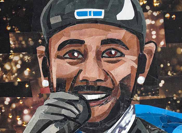
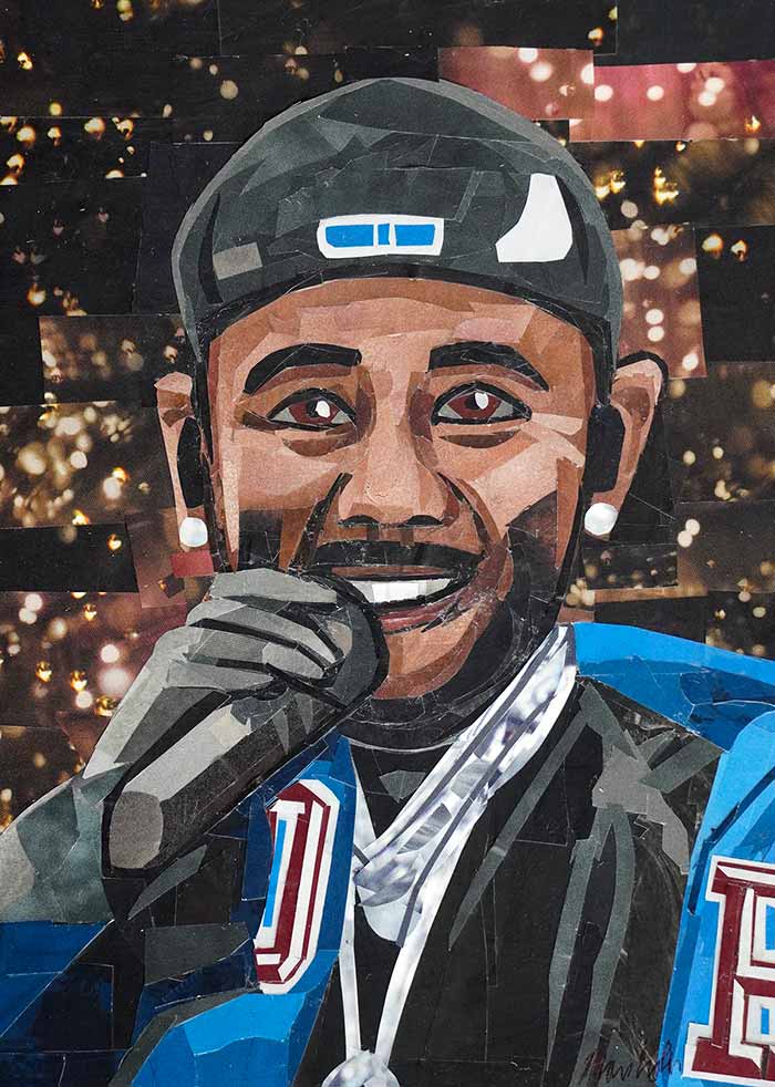
“Say Drake (Kendrick Lamar),” Collage on paper, 7″x5″ Order a print
I’m a little late in making this collage—but that’s just what happens when you’re juggling a lot of projects at once. When I saw this year’s Super Bowl halftime show, I was mesmerized. It was a work of art, and I knew I had to create something inspired by it.
I had a lot of fun working on this portrait of Kendrick Lamar. I loved the grin on his face when he said, “Hey Drake,” and I wanted to capture that energy in my collage. I mainly used solid colors, incorporating more texture into the background.
In general, I’m really happy with how much work I’ve created so far this year. I’ve already made more artwork than I usually complete in an entire year. It’s amazing how much progress you can make when you build more routine into your schedule.